Tuesday, September 22, 2015

Hal Sherbeck Commemorative at Fullerton College


On August 31, 2015, Fullerton College dedicated their football field to the memory of legendary coach Hal Sherbeck and honored him with a day long celebration capped with a fabulous life size bronze statue by Don Treadway. They made commemorative posters based on my portrait of coach Sherbeck and set me up under a shady tent to sign posters for all who were interested, which was right at 500 posters. It was a terrific day where I met old friends like Tom Teeple, Jerry McFarland and Marty Reichman and made many new pals. Another great event hosted by Bob Jensen.


I'm usually skeptical when people monkey with my paintings, turning them into something different, in this case a poster. This time I was pleasantly surprised with what was done. Someone named Todd took my traditional piece and made it look current and dynamic while providing information they needed to convey. Great job!


It was fun to see so many people so enthusiastic about the portrait. They already had the poster and still took pictures on their various electronic devices. I dug it.


Tuesday, May 26, 2015

Bob & Sandra Jensen


I know I keep saying what an honor and whatta treat is to do this and that, but it's really the truth. This portrait is of Bob and Sandra Jensen given on the occasion of Bob retiring as Dean of the Fullerton College Art Department. I was commissioned by the Fine Art Department to do this piece and worked with Sandra on selecting the reference photo and painting size (so it wouldn't be too big to fit in their house). In an art department filled with terrific artists it is really something to have been selected to do this portrait. I got to know Bob while doing the dishes with him after a faculty party and he's quite a great guy... and behind every great man is a great woman, so I genuinely enjoyed doing this piece. I don't usually frame stuff, but since this was a surprise and to be presented at a retirement dinner it needed to be framed. Tim at Leon Picture Frames in Anaheim framed all the paintings for the Fullerton College "Hall of Fame" and Bob had picked those frames, so we did this one in the same style that he picked for the campus library. It really sets off the painting. The presentation went well and everyone seemed happy. At the end of the night Bob & Sandy loaded all their gifts in their truck, but this one went on top.

Wednesday, May 13, 2015

The Dance

 
I really enjoy portraits. Some portraits are very formal and some are very fun. I was very happy to get this gig. Ken Rhoads commissioned this 16" X 20" oil painting as a surprise gift for his wife Becky's birthday. Ken emailed this dyamic (but low-res) image to me as a reference photo. I've had to work from some pretty poor images, once from a 1920s newspaper photo, and they pose some real challenges. Ultimately you have to shift your approach away from any detail and focus on overall gesture. I've had two opportunities to portray Becky (who is one of my all time favorite people) and sadly both have been from poor reference pictures (see "The Rehearsal").  One of these days that will have to get corrected. 
Ken also wanted this lyric from Mr. Tambourine Man to be included someway. I don't do this kind of thing very often, although a lot of the great artists do. I do include a lot of lettering in street scenes and race car sponsor stuff over compound curves, so I'm not bothered by lettering, but typically I'm copying something that already exists. Here I get to figure out the font, the color, the placing and spacing of the whole thing. It needed to be elegant but not a hard-to-read script, big enough to read from a distance but not so big as to overpower the image. Painting is problem solving. I liked this combo and Ken supported my decisions with glowing reviews.

Monday, December 29, 2014

Tipo Latino


This painting was done for Charals Haagen, owner of this terrific Ferrari 212. It is chassis number 219EL and built in 1952. While working for Carrozzeria Vignale in Turin, designer Giovanni Michelotti would do these fabulous renderings of exotic shapes and they would be interpreted by Vignale's craftsmen into three dimensional form. Vignale labelled this car "Tipo Latino" for reasons beyond my knowledge.
 I have followed this car around for almost thirty years and have a ton of reference shots of it from when Paul Forbes had it. There are so many unique features and this is one of the few cars remaining today that still have original paint and interior. This is not the product of what a restorer thinks it should look like, but actually the way it was designed and built 62 years ago.
Here I  did my best to emulate Michelotti's drawing style in the background. Then the actual car is presented in full color if front of the rendering on old blueprint type paper. The car is pale yellow with grey side panels. Although very unusual (and doesn't sound that great on paper) it is strikingly beautiful in person. Italians historically have a brilliant sense of design and color.
I just love this thing and was delighted when Charals asked me to do its portrait. We were introduced by Steve Beckman many years ago and that resulted in Charals buying my original painting "Obsessed". Since then ideas have been percolating in our brains and this is what finally came to boil. Tipo Latino in oil.

Monday, March 31, 2014

Fullerton College Centennial Portraits

During 2014 Fullerton College is celebrating it's one hundredth birthday. It is a big to-do, and rightly so, it is is the oldest continuously running community college in our state. The college has included me in their "Art Legends" gallery show and I am one of a few artists who have been asked to do portraits of significant players in the college history. Last year I did the portrait of a gal named Esther Litchfield Hatch, the first female dean at the college, back in the 30s. This was followed by Leon Leyson (you can scroll down to older posts and find these pieces featured) and now the final four have been delivered.

First Lady Pat Nixon
She was fun to paint, nice doo. It amused me to do portraits of both Pat Nixon and Wavy Gravy in the same year. I wonder how they would have got along.


Coach Hal Sherbeck
I didn't get much reference material on Hal but this shot was irresistible. I got to use the stage lighting effects I learned from studying Frank Lisciandro's photos. The blue and yellow on the shadow side of his face are the school colors.


Leo Fender
Leo's guitars and amps are legendary, but there aren't a lot of photos of the man himself. I was happy to get the cooperation of the Fender museum to get some seldom seen images for reference.


California Supreme Court Cruz Reynoso
Cruz is a Brea boy. We had a nice visit and he was given the opportunity to be portrayed any way he wanted, and this was his choice. His role in civil rights is definitely something to be proud of.

All these were fun to do, each with their own challenges and rewards. Thanks to Bob Jensen for getting me the gig and making the business part seamless.

Wednesday, February 19, 2014

Fullerton College Art Legends


Deborah Davidson, Jon Bush, Dave Maestrejuan, Scott Drake


"Fullerton College Art Gallery presents Art Legends 2014. The Art Department celebrates the Fullerton College Centennial by inviting back alumni and former faculty who have made an impact in the art world." That's what the announcement says. Lo and behold, I'm on the list and my work is on the wall with some real heavy hitters. Whatta treat! 

Back in the day, as a teenager, I went to LA Art Center and then took classes at UCI and then on to Fullerton College to use up the rest of my scholarship money. Scott Drake used to drive me to school because I was usually under the influence by class time. We took Don Treadway's life sculpture class at 9 a.m. (the first college class Don taught), he's in the Legend show too. Also took other classes and not sure how I got home. 

Jump ahead a few decades and I decided to go back to school for art classes. I looked around and found Fullerton College still had the best art program and took up residence there for several years, learning skills and earning accolades. As an aside, its there I met Deborah Davidson, the best art teacher I've ever encountered. She is a BIG reason people succeed at Fullerton and deserves the title of legend as one of the only faculty who is a working artist and as a former student. I am honored to be considered her peer in this show.

The opening party was terrific, everywhere you looked was a prominent figure in art. Nixon Borah, cousin Justin Sweet, Kate Johnson, Jon Gothold, its a long list. There was music and BBQ and of course the art exhibit in the gallery was beautifully done by Carol Henke.

While growing up in Brea I was surrounded by artists of all ilk. Superb musicians were all around us. Scott Gladden, Bill Jacobi, Broc Smith and I were all into drawing and painting. Scott Drake and Ken Ford were masters in ceramics. Jon Bush found success by going into glass. We had quite a little cult of creators and all shared in each others journey. Not everybody chose to go to school, but the ones who did were prominently recognized in this exhibit and I'm honored to be one of the crew.


Monday, November 4, 2013

Under the Lights

A couple months ago I had the opportunity to run under the lights at the Perris Flat Track and its really a different experience from day racing. Since I'm interested in old motorcycles, I've taken to reading old magazines and occasionally find a compelling photograph. This one had elements I like to portray and made good use of photographic effects, like blurred ground and lights. These aren't necessarily visual components, but unique to the camera's eye and I don't use them very often. Here I felt like they were appropriate, helped convey the struggle of controlling the bike and the illusion of speed. The original photo was grainy b&w. I used a very limited palette here, lots of earth tones and ultramarine blue, a touch of red and green with high contrast for the subject help make it snap.

Wednesday, September 11, 2013

The Duel


Lately I've been venturing out to Perris, CA and getting involved with the Southern California Flat Track Association. The first night Deb and I went was a lot of fun. It was safe, well organized and we enjoyed the family atmosphere. So I went back to practice day and got my feet wet on the track. I also shot a couple rolls of film and did some painting sketches based on the the photos. This is "The Duel" and incorporates some of the elements we found under the lights at the track.

Wednesday, July 31, 2013

American Art Collector Magazine


This is fun. American Art Collector is a well respected magazine on art and artists. Deborah was featured in the premier issue and then a follow up article a couple years later. 
Now I'm in the August 2013 issue, although in a different capacity. Recently I was accepted into the Portrait Society of America and through them I was able to be listed in the Portrait Artists Directory on page 68 of this magazine. My work is in good company here, and shows well with these other artists. There is also a web presence with this nifty blurb through December.
There's always room for a portrait in your home or office. There are a million special occasions that can be commemorated with a portrait. Graduations, promotions, a milestone, special interests and loved ones can all be celebrated with a portrait; either formal or fun. Look around and give me a call. 

Sunday, April 28, 2013

Leon Leyson


The latest portrait is of Leon Leyson. I never had the pleasure of meeting him, but many friends have seen him talk at Fullerton College about life and being a holocaust survivor. Leon was the youngest worker saved by Oskar Schindler and his story was portrayed in the movie Schindler's List. Everyone who has seen him lecture mentions how moved they were and what a great guy he is. Fullerton College is honoring him at this year's commencement ceremony and then the portrait will hang somewhere on campus.
The reference photo was taken by McKenzi Taylor and it has elements I like to work with; it is crystal clear, has strong lighting and captures a great expression. I changed the coloring a bit and narrowed the depth of field. I also got wind that he was a wood shop teacher, so I put him in a Penny's kind of wardrobe instead of a suit. This was a real treat to paint and I hope his family finds his positive qualities in the painting.

Wednesday, April 10, 2013

Philanthropic Jester


Scott Gladden turned me on to the Wavy Gravy (a.k.a. Hugh Romney) documentary Saint Misbehavin' and I loved it. Deb and I took a trip to the Mendicino area for no apparent reason and it turned out to be the home of Wavy's Camp Winnarainbow. This was followed by the opportunity to see him tell stories at the Marsh Theater in Berkeley where we each got to spend some one-on-one time with him before the show. So the reason for the trip became apparent; it was a Wavy Gravy trip. He's such the real deal, so sincere and thoroughly himself with a background as deep as a well. 
When I first saw the documentary I was blown away by the photographs taken by Barry Feinstein and immediately wanted to do something with them. It turns out that this year there will be a benefit concert and auction for Camp Winnarainbow and I started working with Assistant Director Timmy Yuen on a portrait of Wavy for the benefit. I did a sketch based on my my first impulse and sent it to Timmy who got the okay to use the Feinstein image. 
The sketch was very close to the finished composition. I tried to incorporate different aspects of Wavy's journey, from beat poet to prankster, activist to clown. This suggested two images of him, the young one with cherubic curls looking admiringly at the robust philanthropist he was destined to become. Progress was rapid because (a) I don't have a lot of work right now and (b) I had new Hendrix to listen to while working. Such a colorful guy got a ton of color worked into the skin. The bubbles are sort of a universal equalizer, everyone is amazed at bubbles and they help him in his work. Frank Lisciandro suggested the Peace sign, couldn't believe there wasn't one in the original sketch. I made up the jester hat, but Wavy admitted to having about two hundred hats ("follically impaired people have many hats") and oddly this one seemed familiar to him.
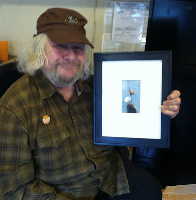

Wavy and Deborah's painting
Deborah made a donation to the cause and presented Wavy with this beautiful clown painting. You could see Wavy melt and described it as "sweet". Jaharana gushed, saying if she saw it in a gallery she'd be sure Wavy would see it, it's just the kind of thing he loves. 

Jaharana, Me, the painting, Wavy, Deborah

Everyone was so nice and appreciative. Jaharana swooned at the image of Hugh from the 50s, "...ohh, that's the man I married". Wavy pointed to the current image and said "and that's the guy you're stuck with." It was a great meeting followed by a full tour of the house, brimming with art and memorabilia. Wavy provided stories behind each interesting object. 
Wavy and Jaharana lead a full and busy life; their attachment and devotion to each other immediately jumps out at you. Fundraising seems to be 24-7 for them and an energetic staff. The time on stage might be the only time they can relax. The positive work they do for charitable causes, particularly Camp Winnarainbow and SEVA, has really moved us and we're delighted to play a small role in their success.

P.S. Both our pieces sold. Apparently Jaharana had mentioned that she was so "touched by how much it (the painting) reminded her of the man she married" to someone who is considered a "very dear friend of the camp" who bought the painting and promptly gifted it to Jaharana. This thrilled me to no end. I so wanted the painting to remain a part of their collection, but I also wanted it to raise money for the scholarship fund. This is success on all levels, everybody wins. 


Gerald Roush - Historian


In America there is one Ferrari historian, Gerald Roush. There are guys worldwide who have historically relevant material and wonderful collections of data, but in the automotive world I only know of two people who are trained as historians, Gerald Roush and Randy Ema. Information from them just has the extra stamp of credibility and it was essential to include him in the Ferrari Flame Keepers series.

Sadly he passed away before I could do a photo shoot with him so this one had its challenges. I didn't have many photo references for this, but Gerald's daughter Cathy sent me a photo of him at his desk that she liked. I too liked that setting but needed a lot more info. I had done a video interview with Gerald in the early 90s and reviewed that footage. I played the tapes and took photos of the TV screen and did some charcoal sketches from those. I used those sketches as reference for his likeness. With all the books and stuff in the painting there were over 160 reference shots.


I did a small portrait and the likeness was fine but it didn't have any story, any punch, just a face. I remembered being in his office, surrounded by files and books and papers, the printer busily churning out the next issue of the Ferrari Market Letter. I felt like I was in the huge library described in Faust and wanted to convey that in the portrait. So I (loosely) based the painting on his desk area with bookshelves towering over him, relaxed and relating a story of how he got involved with Ferrari in the first place (the magazine on the typewriter is the source). I didn't make the background exactly like his environment, there's no memorabilia, just reference material, but it conveys what I wanted to say.

Monday, November 19, 2012

Trofeo Grand Touring


 This one started several months ago when Charles Betz approached me with an idea. He and his business partner Fred Peters have sponsored an award every year at the Ferrari Club of America National Meet for the last ten years and were ready to try something other than the traditional bronze statue. The award is given to a car that is driven regularly, not a garage queen. Chas thought a painting that reflected a driving experience would be appropriate. It would be printed in a series of ten and one given out each year for the next decade. So I started some sketches based on our conversations and did a couple oil color studies to get capture what he had in mind. Eventually we got there and then set up an evening light photo shoot of his 250GT short wheelbase berlinetta. We then picked the right shot, the right proportions for the painting and had Leon Picture Frames make me a canvas.

Everything flowed smoothly, largely because of the groundwork that was laid. I gave Chas periodic photo updates by email and he made suggestions as necessary. The painting was ready on time and subject to approval by Fred and Brooke, which went well. Then off to get the prints made. I use Stan Nishikawa in Irvine. We decided that the actual award would be a bit smaller than the original so I went over everything with Stan who then did a digital capture and set out to do the color correction. In a few days we were back at Stan's to check the proofs he made available and make a selection. A few days later we had the finished prints and took them back for titling and signing. Each one got the quote "The best Ferrari is the one that is driven" in keeping with the trophy theme and was numbered 1 through 10. From there we were back to Leon Picture Frames to pick matting, frame and that ultra clear museum glass. Chas had a brass plaque made so a window was cut in the mat for it and it turned out beautifully.


Then came the FCA National Meet. Every year it's in a different location and this time it was held in Palm Springs. The recipient of the award isn't picked by Betz and Peters, they just sponsor it. The FCA judges picked Ken and Dayle Roath who has driven his 250 Europa in two recent Mille Miglias. That's a thousand miles each time, hard to do more miles than that, plus his usual driving. I have got to know Ken a bit in the last year or so and I'm delighted to know my work is on their wall.

Saturday, September 1, 2012

Fullerton College Centennial


In 2013 Fullerton College will be celebrating it's one hundredth birthday. They are planning to make it a big to-do, and rightly so, it is is the oldest continuously running community college in our state. A few artists have been asked to do portraits of significant players in the college history and I got a gal named Esther Litchfield Hatch, the first female dean at the college, back in the 30s. According to a period press release, she was young, enthusiastic and gay (the original meaning). Her duties included helping female students with their academic, financial and romantic endeavors.
I was provided with several photocopies of school paper and yearbook pictures, small and grainy and when you look at them close, all you see is dots. Its hard to do a large painting (29" X 36") from these, but the challenge was made and I met it as best I could. I picked a photo from early in her career, after all, were commemorating the fact that she was the first, no sense in picking a shot from ten years on the job. The other photos gave me the advantage of seeing how she looked in different light, from different angles and how she looked when she got older. I used these as a guide to capturing her likeness.
I gotta admit, it was rough. Just getting the facial geography right was a challenge. Eventually I used the computer to help me. I printed a copy of the original and then printed a copy of my painting over it, this told me where the painting matched the original and where it deviated. I was amazed at how close they matched. I was looking for a problem with the level of the eyes and was surprised to find the solution was in the width of the base of the nose. I hadn't looked there. Then I did a loose grid to check everything else and made a few small mods to get the desired likeness. The painting technique is a combination of traditional under-painting and glazing, some dry brush scumbling on top, then some more glazes. I really like the end result.
I'm not sure what role the painting will play in the Fullerton College centennial celebration, when I get more info I'll post it here.

Monday, August 13, 2012

Conflagration


This painting is for Rod Drew of Francorchamps America in Costa Mesa. It is Ferrari 250LM (5149) burning at Sebring. This is the first 250LM and really the only one to actually have a 250 engine, the others sporting a larger 275 version. It was originally shown at the Paris, London and Brussels car shows, then campaigned by Chinetti's N.A.R.T. team, where it didn't fair very well. After four race entries its career ended here at Sebring. It was rebuilt and eventually converted to street use, then burned again! Years later the car was reconstructed from the remains which are said to include the engine, transaxle and other significant parts. The car went through other owners and eventually made its way back to the Chinetti family.

Rod had done extensive work on this car sometime back and seems to enjoy seeing it presented this way. He has been after me to do a painting of the car burning for quite some time, suggesting Tom Burnside's wonderful period photograph as a starting point and insisting the guy with the cowboy hat be included. I added other figures to photos of the reconstructed car I shot while back east last year and came up with this. 

This is a glazed painting, 24” X 36” oil on canvas. I did a lot of research for this piece, even going back and finding period pictures of the logos for Sebring firefighters back in the day. I did one color study of oil fire and one of firemen, since I wanted to make up most of the guys. I was happy to have photographs of the real car that I had taken recently, and found many detail differences from the car today and as it was then. Like all Ferraris from the 40s through 60s, this one is unique, and doing the research to present it as it raced on March 21, 1964 was a blast.

Friday, July 20, 2012

Orange County Fair 2012


This is the third time I've entered the fair and I've been lucky that all my entries have been accepted AND I've earned five awards in that time. This year I submitted "Resuscitation" and "The Hub" which pulled a Staff Award and Honorable Mention respectively. 
There was a ton of work in the show, 1900 pieces in the fine arts division (which included photography, sculpture, watercolor, mixed media, digital and many other categories). This year I went to the 'Judge's Walk Through' for the first time. You follow the judges around the exhibit as they offer insights to their selection process and give a light critique of some of the winners. It was pretty 101 but a nice way to see the work through someone else's eyes. They said they liked the way I 'handle paint' and the unique perspective of "The Hub" kept them coming back as they considered the entries for awards.
As a side note we counted the number of entries from Deborah's painting class, there were almost forty, and at least six of them won awards, some of them major awards in both amateur and professional categories. One year ALL the award winners (except one HM) were from her classes. So if you're ever looking for a painting class...

Sunday, April 1, 2012

Resuscitation


This is the latest addition to my series on restoration experts. This scene takes place in the shop of Patrick Ottis Company in Berkeley, CA and features Patrick Ottis (in the tee-shirt) and David McCarthy breathing life back into a Ferrari V-12. Patrick graciously granted me complete freedom to shoot in his shop on two occasions, even though they were under the cloud of show deadlines. This painting was compiled from dozens of shots and it took a long time to come up with this composition; once it was decided, the painting advanced smoothly.


In this painting I reverted to a style I naturally gravitate to, called scumbling. Traditional glazed painting (shown in December 2011 blog installment) starts with a monochromatic (one color and white) underpainting and then several dozen thin glass-like layers of transparent color are added on top make a full color painting that can appear to glow. This is what the old masters, pre-impressionism, did.

This scumbled painting also started with a complete underpainting, but color was added with a VERY dry brush of color and not laid on top, but scrubbed in. It provides a whole different surface to look at and I like to use it occasionally. Check out Patrick's right arm, it's one of the finest anatomy studies I've done. Besides all the stuff in the background, I really like the way the figures came out.

Friday, March 23, 2012

Open House/Studio

Well, the Open Studio was a huge success. There was a steady flow of folks all day, nearly a hundred visitors in four hours. It was fun to see people with common interests meet for the first time and the reuniting of those who hadn't seen each other in too long a time. I hadn't seen Ken and Veronica Kusudo in twenty years!


I can paint, but I'm no good at the food thing, all I could think of serving was a case of Coke and a 50# bag of oats. Food stores are so foreign to me, I don't know what most of the stuff is, I'm just looking for products from Celebrity Apprentice; so Deborah provided the selection of cheeses and snacks to satisfy people's culinary needs. People left with more than full stomachs. A lot of books and prints were sold and there were hourly door prizes. The winners of signed original prints were Barbara and Dick Gladden, Russ Wicks, Cesar Duran and Kelly Capps.


Friends from Brea, Fullerton College, the Ferrari Clubs, clients, buddies, family and everyone else all provided a huge base of support for me. A million thanks!

Monday, March 5, 2012

The Warden


Deb and I went to visit Mark in January. He had been sick and in and out of the Reno hospital for a year and a half. I had seen him a few months ago but now he was home and I wanted to see him there. He looked better on the second day and although he was skinny as a rail, his face was full and his hair was white and bushy like Mark Twain. The next day he went back in the hospital and about the time we got home he had passed away.
While there we looked at the family photos in the room. His wife Carleen pointed out a photo (taken by Skip Waller) that she loved. It was taken about the time the two of them met and (important to me) shot in natural light. I wanted to do his portrait from this picture and Skip gave the okay. Scott Faris suggested the painting be titled "the Warden".
I spent the next several weeks looking carefully at the picture and focusing thoughts about Mark, getting completely lost in the work and going on autopilot a lot of the time. Working from a great photo helps, but knowing the subject intimately takes it all to a different level; one where you don't need conscious thought, just intuition. I tried to make it look like there was a grin under the scowl, which was often the case with him, and found the smile in his eyes, not so much the mouth.
It turned out to be a great way to deal with the loss and I got this painting out of it, which we then delivered to Carleen. She sent a note which read in part "
You captured Mark’s eyes! His eyes had gold flecks in them when he was young, and they showed up in the painting. " I'd have missed that detail if I was looking. It's like other paintings were training and here I had to operate blindfolded, drowned in music and misery and see what comes out at the end of the day. I am really pleased with the results, for me it transcends illustration and borders on art.


Friday, January 20, 2012

Bookcover: Whistling on the Stair


I was so pleased to get a call from Saylor Smith who was about to go to press with his 3rd book and asked me to do a painting for the cover. He had taken a photograph to be used as a guide for the painting, but wanted the subject in an 80's Angel uniform, a bat on his shoulder, a catchers mitt in her hand, and add an interesting but muted background. So sketches were started near the end of November and emailed back and forth until we got a suitable composition. There were a few things I needed to change from the original photo, I wanted the vantage point to be a bit lower and needed more info in the shadows so I got a friend to pose with his daughter and re-shot the scene. I was able to use some of this new info in the painting, but the more I worked with Saylor's original, the more I was able to see in it. I wanted the grandstands as a background right away and found some suitable images, some from the painting "The Hub" made last year. So here it is, I left room at the top and bottom for title and author info, and then worked with Saylor to come up with a layout that he liked, playing the part of a graphic artist, then the publishers went to work polishing it up and making a great presentation.